Wednesday 23 November 2011

Learning Outcomes-Knowledge and Understanding

1. Appraise the issues relevant to character design in various contexts.


When designing characters, there are a many factors to take into consideration. The age group at which the characters are aimed,, and whether they are being designed for films/animations, games, theatre productions or comics, has a significant impact on the overall design.


Another thing to take into consideration is the unique identity the character should have. If it is a main character, it is likely you would want it to be instantly recognisable and distinctive. Also, the intent of the character should be visible, the audience should be able to tell whether the character is a protagonist or antagonist. This encourages the audience to build a first impression of the character's personality and helps make the character more believable.


The nationality of the target audience also can affect the character design. Certain parts of the world can consider certain things offensive. If the character you are designing will be shown to a select audience or country, it is always best to research the cultural background of the audience that it will be shown to. If the character is going to be shown internationally, this becomes much harder to achieve, and is easier to aim at a target age instead.


I will be looking at several different examples of character designs in order to further explore this learning outcome.


FILM/ANIMATION 


When creating characters for film and animations, you need to take into consideration what genre the story is, and at what age group it will be aimed at. Below is an example of a character concept from the film 'Thor'.


KING LAUFEY- Character Concept from 'THOR' 
Michael Kutsche

It shows a menacing, brooding figure, immediately recognisable as fitting into a fantasy genre. The character is distinctive, with bald head and strange, tattooed skin, he already makes a strong impression on the audience. He feels powerful, and to me it is clear that he is not the protagonist. The colours are desaturated, and cold, to match the character's personality. It does not feel like this character belongs to a film for young audiences, who generally prefer more colourful, whimsical characters, like the one shown below:


RAPUNZEL- Character Concept from Disney's 'TANGLED'

This is taken from Disney's 3D animated film 'Tangled'. There is a strong difference between the way in which this character has been depicted to the previous image. It is obvious to the viewer that this is a 'good' character. She appears innocent and slightly vulnerable, yet defiant at the same time. It is a character that children, particularly young girls, would be drawn to and therefore works very well as a concept for a children's animation.
When animating characters, particularly 2D and especially by hand, it is also important to have a character that is easy to reproduce over and over again, whilst still having distinguishing features or clothing.


GAME

As with films and animations, the target audience is a major factor in character development for games. Many games focus around war, horror, sci-fi and fantasy genres and quite often deal with mature themes.

Illidan- Character Design from from Blizzard's 'WARCRAFT' series
Wei Wang

This character is clearly 'evil', with a corrupted, demonic appearance. The design reinforces the personality of the character. The bold colour palette also adds to the strength and power of the character. 
Another concept for an 'evil' character is shown below. This one is for a game aimed at a younger audience. 


LeChuck- Character Concept from Lucas Arts' 'MONKEY ISLAND' series

He is still clearly a villain, yet comically so. The figure is exaggerated with bizarre proportions. Plus, there is a dead bird on his head.


COMICS/GRAPHIC NOVELS

In my experience, the majority of comics are aimed at a male audience, yet span wide age ranges and cultures. The two examples I have picked are typically western examples of 'super-hero' characters. Comic book characters need to be easily recognisable, and artists can do this by assigning certain colours or accessories to a character. Generally this is done by giving them a distinctive 'super-hero' suit.

Wolverine, Character from 'X-men'   

A brutal and dramatic depiction of the character, immediately recognisable as Wolverine. This easy recognition is due to the costume and distinctive 'claws'. The aggression and violence of the image marks it for a mature audience. 

Ben 10, Character from children's comic and TV series

This is a character aimed at young children, particularly boys. Shows a fun, adventurous kind of character, and although he is not in the typical super-hero leotard, he always wears the same outfit and carries a distinctive gadget on his wrist. This helps the artists to be able to reproduce the character with consistency.


THEATRE


Character designs for theatre productions are generally focused around costume. They generally do not need to reinforce the character's personality through pose and body language.


Character designs for 'JAQUES AND HIS MASTER' by Denis Diderot and Milan Kundera
 Marta Roszkopfová

These designs feel more like a mood-board than a polished character concept. This is probably partly due to the fact that the costumes will be seen from a distance and do not need to be particularly detailed. The artist seems to be establishing a feel for the character rather than designing them.


IN CONCLUSION:

All the issues I have explored are very important when designing a character. Particularly having a clear idea of your character's personality and its target audience. The character design should address the issues raised above and should also be designed with the end product in mind. This is what helps to make a successful character concept. 

Tuesday 22 November 2011

Learning Outcomes-Knowledge and Understanding

2. Make informed choices relating to the creation of artwork designed to meet professional requirements. 


I believe that I demonstrated this throughout my work produced for this brief. I had to make informed decisions on colour, composition, shape and form, the outcomes of which can be viewed here: 


http://hayleymerrington.blogspot.com/2012/01/character-design-sheets.html


Learning Outcomes-Knowledge and Understanding

3. Demonstrate an understanding of techniques and methods appropriate to the chosen area of design.


In order to answer the brief, I used several different image making techniques. To initiate ideas, I started with pencil sketches and silhouettes in order to arrive at a suitable pose, composition or form:


I also produced several speed paints. This is a very quick and efficient way of producing work that shows colour,atmosphere and composition:


A 3D modelling program was used to develop the head of the alien character. This allowed for a greater understanding of the characters shape and form:


For the more finished pieces, I used a more detailed and refined painting style in order to make the concepts feel more complete and believable:


Learning Outcomes-Cognitive & Intellectual Skills

4. Investigate and synthesise visual research into the creation of original concepts. 


I looked at many different visual references whilst working on this project. They have been compiled into moodboards, shown below:


 Aztec:


Alien:


The references draw from films, games, existing concept art and real life. Images such as this are very helpful and without such references I do not feel my work would have progressed very far nor been as strong visually. 

I believe the following images reflect my research well:


Learning Outcomes-Cognitive & Intellectual Skills

5. Evaluate and defend own work in the context of contemporary practice. 


I am pleased with the outcomes I have reached for this project. I feel that the images reflect the brief well. My environment in particular effectively tells the story of the Aztec-alien encounter. 


The research aspect of the project was very helpful, it was an interesting process that gave me a better insight into a different culture. It was also useful to see relevant artwork by other artists. By looking at their use of technique and style, I could transfer some of this into my own work and further develop my own painting and drawing skills.


I used a variety of different techniques to produce concepts for this project, from pencil sketches to digital painting and 3D modelling. Using a wide range of processes to produce work allowed me to experiment and reach more unexpected outcomes. Pencil sketches are quick to produce, and so were useful for initial concept sketches. Digital speed paints were very effective at quickly realising environment concepts, particularly with regards to colour, light and composition. I used 3D modelling in order to make my alien's head more convincing and understandable. A more refined painting style was used to paint the final character designs and the final environment piece. As these pieces are more detailed and defined, they feel more like finished concepts rather than working drawings.


I do feel that my artwork has improved and progressed dramatically throughout this project and I feel more confident with each image I produce.


For further development, I would like to experiment more with colour palette, especially for the environment piece, as I feel the mood and atmosphere could be heightened much more for extra drama. I would also like to produce more scenes of the interactions between the Aztecs and the aliens, to better portray the manipulating powers the aliens have over the Aztec people.


The work I have produced could fit easily into either the game or film concept art categories, although personally I feel it would be better suited to film. 


Overall, I am happy with my response to this project and feel that I have answered the brief effectively.

Learning Outcomes-Practical & Professional Skills

6. Explore and evaluate the appropriate skills relevant to the creation of character design.


There are many factors to be taken into account when creating a successful character design. One must consider the pose of the character, as well as the composition, light, shape and form. But before this can be considered, the character's personality and function must be known and understood.


I explored these aspects when composing my character designs by creating many different sketches. These sketches allowed me to investigate what composition and pose would be most suitable. I then painted over the sketches, thinking about light sources and colour palette and what each aspect would say about the character.


The following images show the process of creating my characters:


Learning Outcomes-Practical & Professional Skills

7. Operate ethically demonstrating critical understanding of the issues governing good practice.


Whilst research was an important aspect of this project, it is also important that the work of others is not plagiarised or reproduced. I used my visual research only to initiate my own ideas, rather than copy the work of others. I have included several work-in-progress images showing how I achieved my concepts to re-inforce the originality of my work.


Examples of this can be seen in the following images:


Learning Outcomes-Key Transferable Skills

8. Demonstrate an independent and reflective approach to personal and professional development.


I have found that working on a masters course, one needs to be extremely self motivated and independent as much of the workload is self-initiated. Organisational skills are key, as is successful time management. These skills will prove very useful later as I progress onto a professional level. After receiving feedback from tutors and fellow students, I strived to improve and amend my work according to their advice and critiques. Understanding and being mindful of such feedback is a vital part of personal development as it allows you to see your work from different perspectives. It also allows you to learn from your mistakes, and improve upon your skills.


Learning Outcomes-Key Transferable Skills

9. Exhibit professional communication skills in the specialist area.


The work produced for this project answers the brief well, in my opinion. I think it clearly shows a meeting of the two different species. The environment piece best demonstrates this as it depicts the moment of first contact.


Other images show the manipulating power of the aliens over the Aztec leaders. 


The issues I wanted to communicate have been addressed by such images through use of pose, composition and colour palette.

Thursday 10 November 2011

Aztec Environments

Speedpaint environment concepts for our Aztecs & Aliens project. My favourite is the first one, and am currently reworking it to a more finished level.


Concept Specification

Project Idea:
For this project, I intend to produce pre-production artwork based on a fantasy novel by Freda Warrington. The novel is called ‘The Amber Citadel’ and is book one of the ‘Jewelfire Trilogy’. I believe that this book would make an excellent basis for a film, so I will focus on concept artwork for the environments, characters, races and key-moment visualisations, as if the story was to be adapted for cinema.
Project Aims:
I aim to produce:
-Four character designs.
-Three environment concepts
-Three key-moment visualisations
-Depictions of the four races within the book.
Project Action and Development:
In order to achieve my project aims, I will need to select several main characters from the book to design. I will also need to plan what key-moments I would like to depict and the important environments that are described within the novel. To do this, I will re-read and make notes on the parts of the novel that I believe are the most significant.
To help with the concept designs, I will research the works of other concept artists, as well as pre-production artwork for films of a similar genre. Such artists that I might research are Alan Lee, John Howe and Michael Kutsche. I will also refer to the concept art produced for films such as ‘Lord of the Rings’, ‘Avatar’, all the ‘Harry Potter’ movies and those based on the books of ‘Narnia'. 
As the book is fantasy-based, I could also look into game concept art for inspiration. The work produced by games company ‘Blizzard’ for ‘World of Warcraft’ would be very helpful to research, as it has many aspects in common with the environments and races within Freda Warrington’s novel.
I will use journals such as ‘ImagineFX’ and ‘Fantasy Art’ magazine. These contain useful workshops to help with concept design, as well as interviews with professionals that could help with my research.
I have always been interested in concept art for films and animations, which is why I have chosen this type of subject for my project. Ideally, I would like to continue with these ideas into my final major project as I believe that there is a wealth of imagery within the book that could be explored much further. I would love to have the opportunity to fully develop at least 6 of the main characters, as well as producing a multitude of environments and key-moment visualisations to really bring the novel to life. 
Ultimately, I would like to achieve a polished and concise portfolio of work relating to the novel which would translate smoothly into film. 

Analysis of Line Drawings

My thoughts on the following line drawings :


'NUDE' Egon Schiele


Loose and sketchy, yet still confident. It almost looks as though he has revisited and embellished some parts of the sketch with a more decorative approach; there are loops, zig-zags and swirls overlapping the underlying lines. This makes the piece more visually engaging, and I find myself becoming more interested in the lines than the figure they portray.


'PROPERTY OWNERS' George Grosz


Whilst this image looks carefully and confidently drawn, the figures are not particularly anatomically correct. However, the artist has succeeded in giving his subjects both character and emotion, creating a certain charm for the piece. I think it is this confidence and charm that helps the anatomical 'inaccuracies' to be ignored. The lines themselves look considered and strong and they are not hesitant or sketchy.


'CHOLERA LINE' Ronald Searle


This seems to be an impromptu and spontaneous sketch, representing a moment in time as the artist is seeing it. The strong pen lines capturing each figure, and speedy-looking hatched shading suggests that the artist is drawing quickly to capture the moment. Due to the shading in this drawing, there is a feeling of depth in this piece that the previous drawings do not seem to have.


'BLIND MEN' Hokusai


A charming and characterful series of drawings. Another very confident expression of line, with minimal details doing maximum work. The lines look considered and thought out. I think that the drawings possibly look a little flat, but I really enjoy the characters portrayed within each.


'AKIRA STUDIES' Katsuhiro Otomo


This set of drawings look like they have been composed with under-drawings and worked over. Some of the images have faint construction lines visible underneath the dark final outlines. I do not feel that these images show as much confidence as the previous examples, yet there is still a strong feeling of character in the drawings.


'HOLIDAY TYPES' Jonathan Millward


Very confident, clean crisp lines depicting many characters, each with their own individuality about them. Slightly 'cartoony', it feels as though the artist feels comfortable with the drawing style and is confident in his ability to portray each character with clarity, if not with realism.


'TANK GIRL' Jamie Hewlett


Full of attitude and expression, this is an extremely powerful and confident image. By using white on a black background, the artist has made the image much more dramatic and forceful than it would have been on a white background. There are minimal details and very little shading, yet the image is still full of information about the character.


SET DRAWINGS Ronald Searle


These sketches seem more like a visual stream of consciousness. More doodles than resolved drawings, they were possibly meant to be seen by the artist only, rather than anyone else. The lines feel impulsive; they are free and loose as though the artist was trying to make sense of his ideas through drawing. However, they do not feel hesitant because of this.


'VOGUE' Carl Erikson


This image is one of my favourites among the selection. It feels elegant and accurate, yet free and unconstrained. The messy, smudged shading and occasional 'unfinished' areas of the illustration contrast nicely against the tight, confident lines that depict the characters within the piece. Also the variation in line thickness and quality helps to keep the image interesting.


MEGARA, from DISNEY'S 'HERCULES' Andreas Deja


This drawing is full of character, confidently drawn despite having a sketchy feel to it. A few construction lines are faintly visible yet do nothing to reduce the confidence of the piece. There is a certain power and strength to the drawing which is emphasised by the composition of the character.


SKETCH from DISNEY'S 'ALADIN', Glen Keane


Extremely rough sketch, yet with a strong line of action and sense of character. The lines are loose, fluid and messy, with vague detail only to the face. Feels like a very quick drawing to experiment with pose and action.


'SKATEBOARDERS' Kevin Springet


These seem to be very quick spur-of-the-moment sketches, with the first two showing a strong sense of action. The bottom sketch looks like it probably took more time, with slight shading and more attention to form than movement.


'JUGGLER' Herb Wiersma


Another confidant figure study. The lines have a strong sense of purpose and the minimal use of detail adds to the confidence of the piece. Using a single line rather than a hatched line makes the image feel considered and thought-out. Also the detail in the background serves to add a sense of perspective and depth to the picture.


From 'FLEURS DU MAL' Henri Matisse


This has a very minimalist feel to it, with very few lines being used to create the drawing. The lines feel quite free and fresh, yet deliberate. Despite being so minimalist, it still does have a sense of character and charm to it.


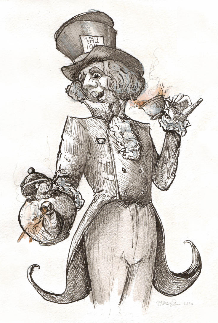
And I suppose I should include a drawing of mine...


'THE MAD HATTER'...by me...


This is a fairly recent drawing of mine. I feel that it has a good sense of action and character, but is possibly lacking slightly in confidence. I tend to worry too much about making mistakes when I draw, and I think that this can negatively impact my work. As well as this, I feel I am also still trying to figure out what my 'style' is. Usually I will used hatched or broken lines, and can find it quite difficult to commit to a single confident line.